
My 2 cents on product design related topics in formats like blogs, interviews or podcasts
Designing an IoT Product From Scratch
The IoT industry is all around us. Many products today easily get “smart” as a prefix, which usually means they connect to a computer or cloud that processes data. That connection brings the product to the next level. All products don’t have to be connected, but when they are, they need to prove their point as users expect that they will get something much better compared to a traditional, non-smart product. At the end of the day, the biggest competitor to a smart product is a non-smart product.
The basics for successful products - IoT or not - are still the same. Within the following three chapters, I’ll try to explain foundational blocks. To start, let’s imagine that you were tasked to solve some problem in the form of an IoT product. Ready, steady, go!
Start with one-pager
First thing you as a team need is a holistic view. You should know where you are going and why. To do so, try to respond to these questions:
What's the company's long term strategy, mission and vision?
What problem are you solving?
What would be the benefit for the end user?
What’s the business case?
What’s the north star of the product?
Prepare a simple one-pager with all these questions and answers. It should be clear and understandable, but you don’t have to address everything in one session. Remember, it’s a process to get there, and it depends on many different factors. You can use various frameworks available online like the Value Proposition Canvas, Problem Solution Tree, Business Model Canvas, Lean Canvas, etc. They all lead you to a one-pager showing clear connections between various questions. Humans are visual creatures, and that’s why this works well. Start with what you know and what you need to find out. The key is to keep your mind open and focus on a problem and user needs, not a solution.
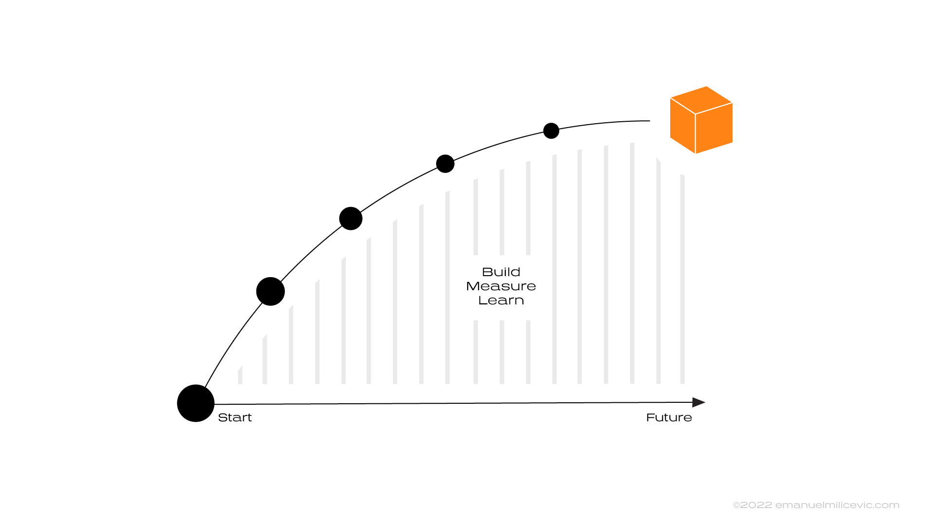
Image 1. The north star will help everyone in the team to visualize clear concept of where do we want to be
To solve a problem and define the north star, you need to be aware of the company's vision, mission, and goals. So why not start there? In case you need to be broader because you’re lacking answers on what problem to solve, there are various research methods you can use to discover what is happening in your market. Signals and growing trends can give you more narrow choices to decide what problem and opportunity space you’ll tackle, and then you can easily translate them to jobs to be done (JBTD) for users.
Let’s say you focused on one problem space where you see an opportunity. At this point, your one-pager should be almost completely filled in. That problem you’ve chosen can be solved in many different ways. But it is essential to have only a few theoretical meetings about potential solutions. Use the time to focus on building low cost prototypes (sacrificial concepts) and trying as many ideas as possible.
One of those sacrificial concepts has proven to be very interesting for users. A company you work for also finds it interesting since there is a clear business case. You are defining the north star for the product and showing other stakeholders how this product will help move the company's goals by satisfying users’ needs or solving jobs to be done. Your one pager should be completed now, and everyone is aware of what is the end result. During the process, you are constantly aligning with users, tech, and business and updating your one-pager. Following iterations of prototypes will additionally define more and more details.

Image 2. From ambiguity to the final IoT product requires zooming in and out all the time while completing and updating your one-pager canvas
The process above has a million more details in each step. It’s not linear, and requires a lot of collaboration and patience. However, with this one-pager, you’re making sure that your company is investing in the right place, and at the same time, you are setting up your team for success. Constantly zooming in and out, reflecting where you are going and what you know to get there. By doing it, your team knows by heart the 'why' and the connected product's benefits for your end user. It’s also good for developing system thinking – a skill that will benefit you in all different ways. Anyhow, if you’re unaware of the whole picture, you’ll face many issues in the bottom two sections.
Keep close collaboration in fluid arrangements
The previous step is nothing new for industrial designers, interaction designers, UX designers, or product owners. It’s similar to building any digital or physical product or service. However, aligning hardware and software teams seems to be a new challenge for IoT companies. In theory, the solution is simple. If you want to make a truly great IoT product, you need close cross-functional collaboration and teams that are in love with the problem space.
“Connected devices in IoT do not operate in a vacuum and neither can the engineering and development teams who are responsible for their creation.” – THINK blog by IBM
Making a truly user-friendly IoT product is a balancing act between industrial and hardware design versus software and digital design choices. Hardware can’t be easily changed once on the market. Software, on the other hand, can’t replace well-crafted physical interaction or material look and feel. Digital solutions are more error-forgiving since you can quickly update them. However, both hardware and software can enhance each other when designed together. Every physical product should, in some way, incorporate principles of industrial design. Those principles state that products should be sensorial, simple, enduring, playful, thoughtful, sustainable and beautiful. And you should apply it to their digital parts too.
Reality is more complex. There are a lot of tradeoffs to be made along the journey. That’s why concepts need to be completed and measured from experience, tech and business points of view throughout the product life cycle. The best sports teams have experts in different areas within a lot of different tactical formations that can be executed depending on the moment and need. The same can be applied for (IoT) teams. Experts from various fields should work closely together, in fluid arrangements, with a clear overview of where they are going (see the first chapter). It’s not easy to arrange that but it’s the only way to make smart decisions and to keep balance between physical and digital design and development choices.
“There are several types of limitations you’re certain to run up against: What the current technology can do, what you can afford, what your manufacturers can make possible, how much you can outsource, how much time you have to get to market, and much more,” says MacBeth. “Sometimes it will be something as detailed as a radio protocol that will only give your device so much range. First make a list of these constraints, and then ask yourself if they are real or surmountable.” – Software is Eating Hardware by First Round Review

Image 3. IoT products must be designed and developed as digital and physical parts together
Think about your IoT product as physical and digital parts together. It will allow you to start planning your strategy much smarter. Then by enabling close collaboration, in different ways and times, between brand designers, industrial designers, UX designers, software developers, hardware developers, firmware developers, and quality assurance developers, you’ll be ready to build a great product.
Create one user journey
When we look at industrial design or the digital design process in isolation, there is less complexity since there are fewer places where things can go wrong. It’s easier to anticipate, take decisions and solutions for various use cases. While using a smart product, users switch between physical and digital interaction spaces, and that adds complexity to the design process.
Extra layers like LED, on-device screens, physical buttons, internet connection, talking touch points within the system, cloud, and all other digital and physical interactions add more nodes where things can go wrong. It means a lot more errors or edge cases to handle in a user-friendly way. It’s easy to design happy cases, but real experience thrives when we manage all the not-so-pleasant moments within the user’s journey. Remember that users are not very forgiving of errors and your smart product can easily end up disconnected at the bottom of a drawer.
With all that said, to make an excellent smart product, you need to combine both design processes into one. This results in many more use cases throughout digital and physical contexts to think about. The process becomes more complicated and requires more team alignment and patience.
The good thing is that every product and user goes through a similar user journey, whether physical, digital, or combined. By uniting these journeys, you will get something like this:
Awareness (marketing and advertising)
Purchase (physical or digital stores)
First-time setup (out of the box – packaging and manuals, assembly, digital onboarding, configuration)
Use (control and interact, get insights and suggestions)
Maintenance (cleaning, updating software, troubleshooting)
Manage (reconfiguring, upgrading hardware)
Decommission (repurpose, sell, recycle)
Help & Support (support in each step of the journey)

Image 4. User journey you can use to build your next IoT product and not miss to design key moments of experience
This journey is just an example, some things can be moved between sections, and you can make your journey by adding or removing steps. The idea is to list all steps and context-switching to see where and how your teams need to collaborate to design the best solution.
For example, you'll notice that help and support should be present throughout the journey since the user might need different guidance at each step. From online or in-store information before purchase, manuals and support after purchase, first steps while figuring out how things work, maintenance and manage on how to clean product or fix issues, to how sustainably dispose of your product.
You’ll also see that there will be a lot of touch-point switching. The user opens the box and skips the paper manual (or not). Then it is time for the device interaction. The device shows some LED behaviour, emits sound or vibration. In the meantime, the user is interrupted by something or someone in the physical world. Later user connects a physical product with another device that has a display and more computing power. User doesn’t understand completely what happened, so it’s time to go back to reading paper or digital manuals. After solving the problem, it’s time to set up and use the product. At some point the product gets disconnected. Is it still usable, or is it dead? What now? How to troubleshoot it? How many technical details can we talk about without overwhelming the user but still providing a solution? Physical device shows something, as well as the digital part. Again, switching between touch-points.
This story can continue with more details on the way, but the main takeaway here is that most products go through a similar journey and IoT products have extra layers of complexity to deal with, e.g.:
Minimize friction when switching contexts,
Align and complement interactions,
Align users' mental models with how the system works,
Support with first steps, when the user is stuck, or things go wrong…
Above mentioned topics are nothing new for industrial designers or UX designers, but they need to be designed and thought through together, not in isolation, for every product. It is only possible if all teams look and work on the same journey.
Ready to design a successful IoT product?
Great experience for IoT products is not rocket science or something groundbreaking. It all comes back to basics. With clear goals and value for users, a holistic view, closely collaborative teams, and starting from user needs, truly meaningful smart products can be made. Remember, not every product should be connected as it can solve problems smartly by not being connected. But when connected, it should solve real issues thanks to an end-to-end design and development – both physically and digitally.
How N26 Wins Users with Data-Driven UX Design
“In this episode of Disruption Talks, we spoke with Jolene Tan-Davidovic, Lead User Researcher, and Emanuel Milicevic, Lead Product Designer at N26, to learn more. They share behind-the-scenes details about conducting user research, and using psychology and hard data to create the best data-driven UX design.”
Navigating Mobile Apps – Specification
Part 3 of 3
Illustrations by Lana Milinovic
In the previous two articles, you could read about the high-level flowcharts and you learned about navigation patterns rules for each platform. In this last article in the series, I’ll deep dive into specifications and conclude the navigation topic overall. Let’s jump into the specs.
Title choices
Both platforms have similar choices for titles. The main difference is the title alignment.
iOS
Large title left aligned (for the top-level parent navigation)
Regular title centered (for the child navigation)
Android
Prominent title left aligned (the parent and child navigation)
Regular title left aligned (the parent and child navigation)
Above mentioned options are the default ones provided by the platform. I noticed additional types popping out like:
Title w. subtitle
Large and long titles for child screens
Large image w. the title below
Interactive titles
No title
Material Design describes very nicely the role of the title. It provides value to the user by showing the screen the user is currently on, the section the user is currently in, or the app being used. It's a must-have, so if you go with no title in the navigation component, you need to make sure that the user can easily identify where they are. Other than that, creativity is yours.

Most common navigation title choices
Interactions
When choosing a proper navigation type it's valuable to know what kind of interactions users can perform on a specific screen. Especially about how the screen can be dismissed. In this article, I'll focus only on navigational interactions, as on-screen interactions could be a book long read.
The most common navigational interactions for the child screens are:
Swipe right
Swipe down
Swipe up
Swipe left
Tap
Swipe right (from the edge)
Go backward in a navigation flow (iOS all versions and Android from version 10 with the gesture navigation)
Show off-screen content like the navigation drawer (Android)
Android versions below 10 don’t have a swipe right to go back gesture. Users can navigate back by tapping on the Up or Back button.

Swipe right interactions
Swipe down
Dismiss modal or minimize chevron screen (both platforms)
It will dismiss small bottom sheets or bottom sheets with the handle that can expand to a full screen (both platforms)
Refresh page content. Be aware that swipe down to dismiss the screen can interfere with this interaction (both platforms)

Swipe down interactions
Swipe up
Expand bottom sheets to a full-screen modal (both platforms)
Close the app if it’s swiped from the bottom of the screen (iOS and Android)
Scroll to see more content (both platforms)

Swipe up interactions
Swipe left
Switch between tabs (Android)
Go backward in a navigation flow in the flow (Android 10)

Swipe left interactions for Android
Tap
Going forward in the flow by tapping on an element (in most cases)
Tap on a segmented control to see the next tab (iOS)
Going back if it’s performed on the Back or Up icon (both platforms)

Tap interaction usually moves user forward, unless it’s a back or cancel button
Transitions
Moving users through the flow is seamless only when you choose the right transitions that are invisible to the user (or when they feel natural). How do you choose transitions?
First, you choose them by platform rules and then if you have more time, feel free to experiment. Based on the types of axis we mostly use for navigating, I like to divide platforms by:
X-axis transitions dominant - iOS mostly uses slide left/right transitions on the x-axis for navigating further in the flow
Z-axis transitions dominant – Android-based devices navigate further in the flow by using zoom in/out or container transform via z-axis
Y–axis transitions are present on both platforms for slide up/down modal views and action sheets. I will not go further into details, you can check transitions on respective platform guidelines. You can also find a nice side-by-side comparison on this page.

iOS X-axis transitions and Android Z-axis transitions
Tab Bar and Bottom Navigation Bar
Main specs
I would not spend too many words here. The main thing to know is that both platforms suggest using three to five tabs on mobile devices. For tablets, Apple noted that you can add a few more. The rest you can find on Apple and Material guidelines.
Visibility
I've participated in various discussions and read some interesting articles on how to properly implement the bottom navigation visibility. In the end, my conclusion is these options:
Keep it visible always, unless you have a high-cost task, then hide it
Keep it visible on top-level parent screens and hide it on all child screens
If you deep dive into the official guidelines from Apple, you can find that "it should remain visible everywhere. The exception to this is in modal views.". Material Design gives you the choice of showing or hiding it after the parent screens by saying “When moving downward in the app’s hierarchy... a bottom navigation bar can be displayed persistently for quick navigation between an app’s sections.".
Users can benefit additionally from having visible bottom navigation:
The bottom back button – On iOS, it can be used as the back button, which can be easier to reach. Some apps implemented this on Android also (Instagram, YouTube), but didn't run into this often.
Back-to-top button – When a user scrolls down, they can tap on the navigation item and use it as a back-to-top shortcut on both platforms.
I prefer to keep bottom navigation visible whenever it can be. So that it serves as a high-level breadcrumb for users. I also hide the bottom navigation for a walkthrough or focused screens (high-cost action flows).
However, it all depends on the context and goals of your app. Before making any final calls regarding bottom navigation visibility rules, you need to answer the question – Is it important for users to be able to switch the context fast? If your user doesn't need to be able to switch fast then don't show the bottom navigation on child screens, and vice versa, show it if it’s needed.

Bottom navigation visible all the time vs. hidden on all child screens
Test it, test it, and test it
That’s it! Now you know everything to create smooth navigation. But have in mind that navigation is always contextual. Think about how the user reached content. What was a path? Even if the content is the same, the path might be different.
You can read the guidelines and follow them blindly. But my advice is – test it. Create a quick prototype (at least that's easy today) and test it by yourself, test it with your coworkers, test it with your users, test it on competitor apps, test it on most popular apps, and test it on both platforms. Switch your phone for a month or two and get familiar with another platform. Answer the questions like – Does it feel right? Is it invisible? Is it smooth? Is it familiar to our users? Do they complete tasks fast? Test the shit out of it, until it feels smooth. Once you gather the findings, establish your rules to follow and document them in the design system for your product.

Create prototypes and test your navigation
The above written are guidelines and the conclusion based on official documentation and my experience. At the end of the day, if your (custom) app navigation doesn't give a headache to your user, then you’re good to go.
You're the champ for reading all this till the end! High five! Also, feel free to share any comments or feedback with me.
When writing this article iOS 14, Android 11 and Harmony 2.0 was the latest mobile OS version.


Navigating Mobile Apps – Patterns
Part 2 of 3
Illustrations by Lana Milinovic
In the previous article, we talked about the feeling of space, how to prepare flowcharts, connections between screens, and now you are ready to build screens with the proper navigation patterns.
Often at this stage, I see a lot of question marks. When to use which pattern? How do I know it’s the proper one for my flow? Will the user be able to navigate easily? As with most topics when you are starting, first you need to learn the rules (and behaviors) then you can experiment. The second thing is to practice, to get "the feeling". Let’s dive deep into the rules first.
For both platforms standard places to look for rules are Apple Human Interface and Material Design guidelines. To save you some reading time, the most common navigation types are:
Parent navigation
Child navigation
Sibling navigation
Unique cases

Navigation types visualized with the flowchart
Components that you will use for the navigation types above mentioned are:
Navigation bar (iOS), top app bar (Android)
Tab bar (iOS), Bottom navigation and hamburger menu (Android)
Segmented controls (iOS), tabs (Android)

iOS and Android default component choices
Before we continue, I would like to clarify naming and behavior differences between platforms regarding the back button that is good to have in mind.
iOS
Back (back button) – Takes you always one step back inside the app only
Android
Back (bottom nav back) – Back that goes back as much as it can (to the previous app also)
Up (top app bar back) – The same as iOS, takes you always one step back inside the app only

iOS and Android back differences
Parent navigation (top-level)
As the name itself defines, this is the backbone of your digital product. All pages on the parent navigation are hierarchically the same level.

Imagine parent navigation like entering the highway in a car for the first time and you can choose where to go
Components that can be used are:
Tab bar/Bottom navigation
Hamburger menu
Tabs
Depending on the app architecture you'll choose the type of navigation best suited for your needs. All of them have pros and cons. In most cases, we chose between the first two. You can also see use cases of the bottom tab navigation and hamburger menu used together. I try to avoid that by going back and checking if I can simplify or reorganize the architecture. My main reason is that if everything is important then nothing is important. However, if you test it and it's fine for the users and good for the business, go for it!
Tabs are mostly used as a sub-navigation of the parent screen. At the moment I didn't see heavy usage of tabs as strictly primary navigation, but you can find it here and there. Again if your usability testing shows that it's a great fit for your app, go for it!
Parent screens from the flowchart translated into navigation patterns
Navigation bar
With all types of the parent screen, you'll need to design the navigation bar too. It consists of these elements:
Title
Left icon
Right icons

Default navigation bar options and elements for parent screens
All icons are optional and can be either fixed or contextual. By fixed I mean that the same icon is visible on all parent screens. Important is that there is never a back arrow or X close icon since the user is not yet in the flow.
Child navigation
Everything that is not parent navigation is considered child navigation. Every screen reached after navigating from the parent screen. My focus in this section will be on patterns in the top navigation bar. Bottom navigation bar visibility will be tackled in a separate section later. My differentiation is based on the icons that allow users to go back. Options are:
Back arrow (default child navigation)
X close (modal navigation)
Chevron down (chevron modal navigation)

Child navigation options
When to use the back arrow?
The back arrow should be used as the default option. This means that every time a user navigates to another level (child page) in the flow, using the back arrow will bring them back to the previous step. This is the safest no-brainer option and while communicating I call this the “default child navigation”.

It's like driving on a highway and then at some point you decide to go back
Have in mind again that Android users have two back arrows. Back and Up as mentioned above. For going forward, the user will pick some option from the screen or you'll provide an explicit forward button or action.

Back navigation usage example flow
When to use X close?
X close button is used on full-screen modals. When communicating, I call this “the modal navigation”. While the user is in the flow, they make a quick action and go back to the main flow. The rule I follow here is that actions are performed on one screen only (or maximum 2 screens). The most common cases are filtering, editing, creating an event, paying, camera view, PDF and Web View, and image view. Avoid creating long flows in the modal window.

Think about this like stopping at a gas station – do your thing, fill the car, refresh and go back to the highway
You might also ask me where to position X? I wish I can only say one word, but I can't. Material guidelines on Android are straightforward. The X always replaces the Up back icon on the top left side. On iOS, however, we have mixed feelings. Apple suggests using textual actions to verify or dismiss the modal screen, but without consistent use, so I can’t tell you the official rule. They sometimes also use the X close icon. New apps position X mostly on the right side (sharing and actions sheet and full-screen modal views). As they don’t have strictly defined rules, you can see some apps placing X on the left side, right side, or even both sides in the same app. Hopefully, Apple will update the guidelines in the future. Until then, I’ll share “my unified rules”.
Modal navigation usage example in the flow
My rules for full-screen modals go like this... Back/Close/Dismiss would be on the left side. Next/Confirm/Apply should be on the right side. For sharing actions and bottom sheets I would remove X and use just handle, swipe down, or tap the empty space above on the screen to dismiss. Also, having modal over modal over modal is not a pleasant experience. So, try to avoid that.

The interaction rules I follow for full-screen modals
When to use the chevron looking down?
This type of navigation is commonly used when users need to be able to minimize a screen and do something else, while in the background this screen is still processing data.

It’s like an infotainment system in your car, easily reachable but not in focus while driving
A minimized screen is transformed into a smaller component that is visible all the time to the user. The component is easily reachable and maximized. Some examples are YouTube or Masterclass video player, Spotify player, Messenger video calls or chats, apps for navigation and similar. I call this the “chevron modal navigation”.

Minimize screen and open it quickly via permanent component on the screen
Sibling navigation
This navigation type is used when you have content at the same level, but it is more digestible for the user if you break it down. Those are Android tabs and iOS segmented control.

Think of sibling navigation as seats in the car, everyone is in the same car
Material design description states, “Tabs organize and allow navigation between groups of content that are related and at the same level of hierarchy.” and “Sibling transitions occur between peers that share a parent...”. Based on the selected tab, the content below will change accordingly. Tabs are mostly positioned below the Navigation Bar/Top App Bar.

Segmented control or tabs components for sibling navigation
Unique cases
The most common unique cases worth mentioning are Search, WebView and PDF views.
Search
On iOS and Android, search has predefined UI and behavior. By default, the search will replace any type of navigation title. Most apps follow platforms’ native behavior, while UI or transitions are tweaked a bit to be aligned more with the brand look and feel.

Default iOS and Android search patterns
WebView and PDF view
Good thing is that both platforms have predefined WebViews (official names are different). Of course, you can customize design such as some companies do, or you can use predefined as follows. On iOS (SFSafariViewController) you will have “Done” on the left side, icons on the right side, a web domain in the middle, and a toolbar at the bottom. On Android, multiple options are available (WebView and Chrome Custom Tab). The most recommended option is Chrome Custom Tab. In terms of navigation, the Custom Tabs have the X icon on the left side, the action icon and overflow menu on the right side, and a web domain in the middle.

Default web views
In case you need to show a PDF in the app it’s good to know that (at this point) it’s much easier to do it on iOS than on Android. iOS can use PDFKit and open a PDF within the app, while Android can open it with other apps on the phone or you can use third-party android libraries to view a PDF within the app. Both platforms don’t have a predefined navigation design. Therefore, my suggestion is to use the default child navigation (with the back arrow) when PDF is part of the flow (mostly this will be the end of the flow) and the modal navigation (with X) when you break the flow.

iOS build-in PDF view and my Android PDF view recommendation when it’s possible to have it in-app
Now that you know the patterns and how each one should be used, let’s look at the detailed specification about title choices, interactions, transitions, and Tab Bar/Bottom Navigation Bar visibility, in the next chapter.
Navigating Mobile Apps – Flowchart
Part 1 of 3
Illustrations by Lana Milinovic
I've seen quite a few mobile applications struggling with the navigation topic. When to use parent-child navigation, when to use modal, when to use bottom navigation, hamburger, tabs, and other options?
I could easily jump straight to the explanation, but to be able to make the right decision when designing app navigation, let’s first understand how we navigate the world.
Simplified Navigation Theory
In a nutshell, my differentiation starts with two navigation types based on the space. We navigate through the 3D or 2D world.
By taking a quick look from the first-person perspective in a 3D world, and when designing for AR/VR, navigation consists of x, y, and z-axis:
X = left, right
Y = up, down
Z = forward, backward
Disclaimer: I use the X, Y, Z axes for the above directions of movement. In some literature, you can see axes used for different directions than mine.
When looking at or designing flows in a 2D world, the navigation consists of x and y axis:
X = forward, backward
Y = up, down

3D and 2D world
Let's imagine that we are driving a car. How this would look like when you are driving in both worlds:
2D driving would feel like a top-down perspective in the early days of GTA II
3D driving like in the GTA III and new releases
It could also be like navigating Super Mario OG vs. Super Mario 3D World.

2D world in GTA II vs. 3D world in later versions
In this article, I will focus only on 2D world navigation in mobile apps. By looking at the Material Design guidelines, you will see the use of the 3D world to explain elevation. You need to know that too. If you are more interested in 3D world navigation, there are some nice designing tips here.
Okay, now that we have a feeling of space, let's navigate further.
Start with the flow
Before you start choosing the right navigation pattern for your wireframes, you should be aware of the app's information architecture and know the path or the flow (the action or fact of moving along in a steady, continuous stream) of your user. You need to have a zoomed-out image of user movements across the app.
There are various forms and options on how to visualize the (user) flow. Here are my favorite diagrams and their interpretations:
Flowchart – zoom out
Task Flow – zoom in
User Flow – zoom in 10x
Flowchart – zoom out
Browsing online, one could find a lot of different fidelities and explanations for flowcharts. I define it as a diagram of the whole app (or part of the app if you have a really really large beast of the app). Usually, it's a complex thing and that's why I like to simplify it a bit. Rules that I follow:
Every rectangle presents one screen
You are not allowed to connect backward
Never draw the same flow twice
When drawing a flowchart, I start by asking myself “If I tap on something on this screen where would I end up?”. In 90% of the cases, users can go back, so there is no need to draw that. If that’s not the case, you’ll describe that in later stages. If the part of the flow repeats, write the name of the first screen in a rectangle and add an arrow (→) that means the flow is already created before. This way you reduce complexity. In addition, always have a legend with explanations so that everyone can understand it.
By looking at the structure, you can see how complex it is for a user to finish a task. At this point, you already can see if you need to cut some steps. A flowchart is never done, so don’t try to perfect it.

Flowchart of the whole app (the simple example)
Task flow – zoom in
Task flow is usually described as a single flow completed similarly by all users. And it's a good definition. I usually use them as a starting point in drawing the happy flow (with the least amount of friction, no branching, no actions, just screens) for one user and then check if it's the same for others. When it's not the same, then make a separate one.
Creating a happy flow shows us which screens are needed if everything works perfectly. Then from this point, zoom into the details and understand actions with the User Flow.

Happy path for a single flow also known as the task flow
User flow – zoom in 10x
This flow type helps you to stretch your thinking and ask yourself "What else could happen?". Take a happy path (task flow) and branch out to all possible cases and decisions. Go into details and document all the things (include your cross-functional team for the best results).
Be aware all the time that your user flow is a part of the whole app. That's why it is good to have an app flowchart overview close to you.

All possible cases visible in the user flow
The creation process is never linear. Sometimes I start with the task flow and then connect it to a bigger flowchart, sometimes it’s the user flow workshop and then we simplify it to the task flow and so on. After having flowcharts, the next step would be to draw wireflows – also known as wireframe flow where you need to decide on navigation interactions.
By visualizing all the flow types, you can understand the information architecture and feel user movement in your app. This will enable you to make the right decisions on how navigation should behave. Before you jump into wireflows, let’s see in the next chapter, what kind of navigation types you can use.
The method above is my personal approach. If you would like to learn more here are some useful links:
Contextualizing N26 Colors
Color is one of the key parts of your brand. It’s also one of the most exposed. Therefore working on any intervention regarding the color palette can be very tricky, no matter the size of your company. Our brand designer Maja and I embarked on the journey of scaling the N26 color palette from 8 shades to 50 shades, in the peak of the 2020 pandemic.
This blog post can be fully read on this link ↗︎
Earning User Trust in Digital Payment Solutions

The fintech market, which still lacks a clear definition even within the industry, has hit major numbers in 2019–over 3,5 billion users have around 4,8 trillion euros to spend across approximately 13,000 technology-powered financial companies.
As the market keeps increasing, fintech companies’ need to respond by continually investing significant effort in order to keep their customer number counter growing.
This blog post can be fully read on this link ↗︎
A Great Design Portfolio Is an Ace up Your Sleeve

Having gone through dozens of portfolios and participated in multiple candidate selections in the last couple of years prompted me to share the best practices for creating a design portfolio and propose a set of guidelines that could simplify this intimidating task.
This blog post can be fully read on this link ↗︎
Keep It Clean: Project Folder Organization Template

Designers like to work in a creative mess and that’s totally fine when you work as a one-man band (“badum tish”). If we add a client, a developer, the client’s developer, a second designer, a project manager, and other stakeholders, things must be well defined and organized.
This blog post can be fully read on this link ↗︎
Design More, Sketch Less

From time to time I get a question from my teammates: “Hey Emanuel, is there a Sketch plugin for...?” My answer is usually yes, Sketch’s got a myriad of extensions that can help improve your workflow. I recently delivered a talk on the topic, so I thought I’d be a good share. This list is intended for all smart, yet lazy designers who want to focus on experience and beautiful design, not on pushing pixels. Yes, there are plugins for that in Sketch.
This blog post can be fully read on this link ↗︎
Drop me a message
If you are looking for a design speaker for your next event, blog or podcast. I love to share and exchange knowledge about design and development of digital or IoT products, design culture, and many more.