
Navigating Mobile Apps – Patterns
Part 2 of 3
Illustrations by Lana Milinovic
In the previous article, we talked about the feeling of space, how to prepare flowcharts, connections between screens, and now you are ready to build screens with the proper navigation patterns.
Often at this stage, I see a lot of question marks. When to use which pattern? How do I know it’s the proper one for my flow? Will the user be able to navigate easily? As with most topics when you are starting, first you need to learn the rules (and behaviors) then you can experiment. The second thing is to practice, to get "the feeling". Let’s dive deep into the rules first.
For both platforms standard places to look for rules are Apple Human Interface and Material Design guidelines. To save you some reading time, the most common navigation types are:
Parent navigation
Child navigation
Sibling navigation
Unique cases

Navigation types visualized with the flowchart
Components that you will use for the navigation types above mentioned are:
Navigation bar (iOS), top app bar (Android)
Tab bar (iOS), Bottom navigation and hamburger menu (Android)
Segmented controls (iOS), tabs (Android)

iOS and Android default component choices
Before we continue, I would like to clarify naming and behavior differences between platforms regarding the back button that is good to have in mind.
iOS
Back (back button) – Takes you always one step back inside the app only
Android
Back (bottom nav back) – Back that goes back as much as it can (to the previous app also)
Up (top app bar back) – The same as iOS, takes you always one step back inside the app only

iOS and Android back differences
Parent navigation (top-level)
As the name itself defines, this is the backbone of your digital product. All pages on the parent navigation are hierarchically the same level.

Imagine parent navigation like entering the highway in a car for the first time and you can choose where to go
Components that can be used are:
Tab bar/Bottom navigation
Hamburger menu
Tabs
Depending on the app architecture you'll choose the type of navigation best suited for your needs. All of them have pros and cons. In most cases, we chose between the first two. You can also see use cases of the bottom tab navigation and hamburger menu used together. I try to avoid that by going back and checking if I can simplify or reorganize the architecture. My main reason is that if everything is important then nothing is important. However, if you test it and it's fine for the users and good for the business, go for it!
Tabs are mostly used as a sub-navigation of the parent screen. At the moment I didn't see heavy usage of tabs as strictly primary navigation, but you can find it here and there. Again if your usability testing shows that it's a great fit for your app, go for it!
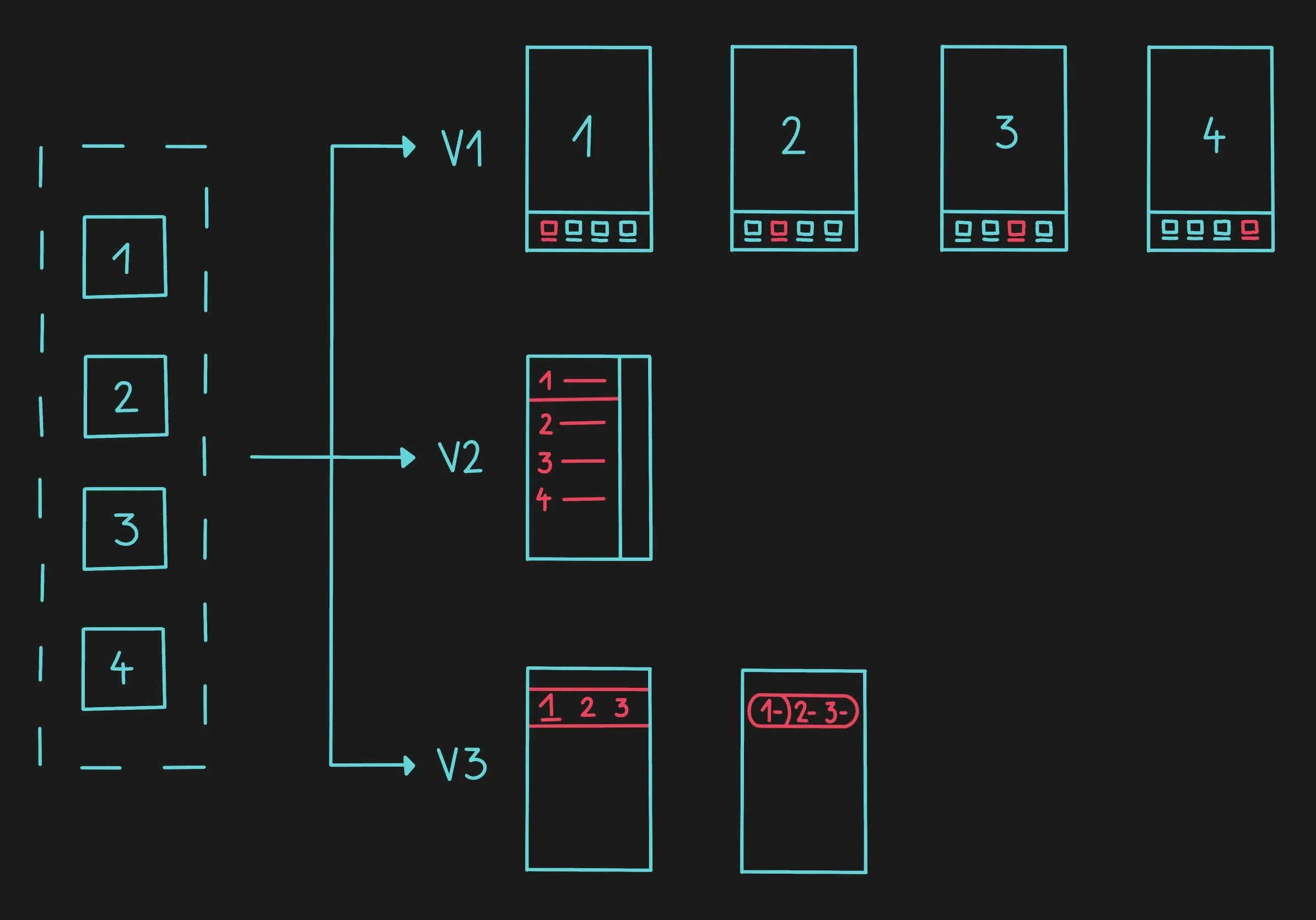
Parent screens from the flowchart translated into navigation patterns
Navigation bar
With all types of the parent screen, you'll need to design the navigation bar too. It consists of these elements:
Title
Left icon
Right icons

Default navigation bar options and elements for parent screens
All icons are optional and can be either fixed or contextual. By fixed I mean that the same icon is visible on all parent screens. Important is that there is never a back arrow or X close icon since the user is not yet in the flow.
Child navigation
Everything that is not parent navigation is considered child navigation. Every screen reached after navigating from the parent screen. My focus in this section will be on patterns in the top navigation bar. Bottom navigation bar visibility will be tackled in a separate section later. My differentiation is based on the icons that allow users to go back. Options are:
Back arrow (default child navigation)
X close (modal navigation)
Chevron down (chevron modal navigation)

Child navigation options
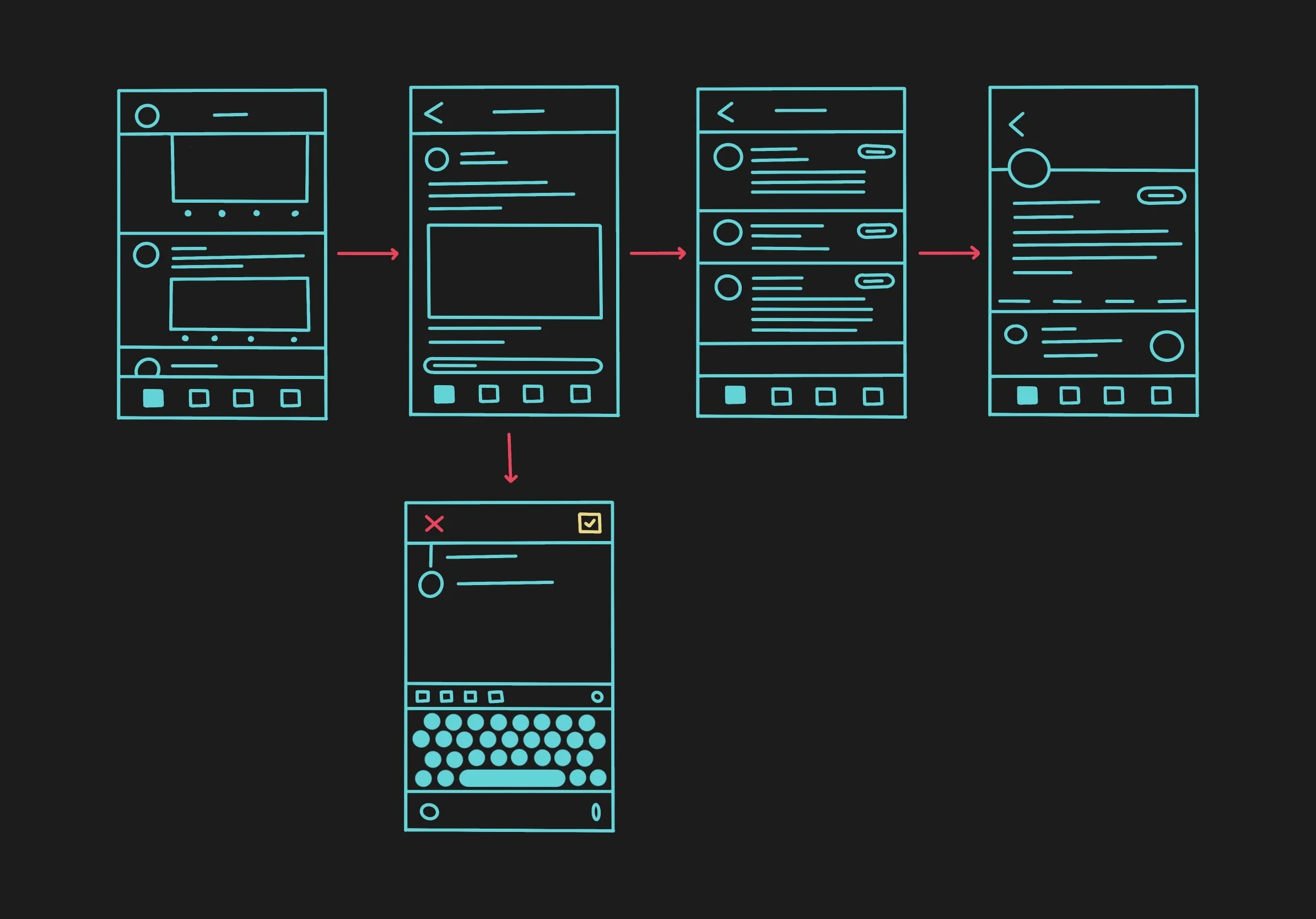
When to use the back arrow?
The back arrow should be used as the default option. This means that every time a user navigates to another level (child page) in the flow, using the back arrow will bring them back to the previous step. This is the safest no-brainer option and while communicating I call this the “default child navigation”.

It's like driving on a highway and then at some point you decide to go back
Have in mind again that Android users have two back arrows. Back and Up as mentioned above. For going forward, the user will pick some option from the screen or you'll provide an explicit forward button or action.

Back navigation usage example flow
When to use X close?
X close button is used on full-screen modals. When communicating, I call this “the modal navigation”. While the user is in the flow, they make a quick action and go back to the main flow. The rule I follow here is that actions are performed on one screen only (or maximum 2 screens). The most common cases are filtering, editing, creating an event, paying, camera view, PDF and Web View, and image view. Avoid creating long flows in the modal window.

Think about this like stopping at a gas station – do your thing, fill the car, refresh and go back to the highway
You might also ask me where to position X? I wish I can only say one word, but I can't. Material guidelines on Android are straightforward. The X always replaces the Up back icon on the top left side. On iOS, however, we have mixed feelings. Apple suggests using textual actions to verify or dismiss the modal screen, but without consistent use, so I can’t tell you the official rule. They sometimes also use the X close icon. New apps position X mostly on the right side (sharing and actions sheet and full-screen modal views). As they don’t have strictly defined rules, you can see some apps placing X on the left side, right side, or even both sides in the same app. Hopefully, Apple will update the guidelines in the future. Until then, I’ll share “my unified rules”.
Modal navigation usage example in the flow
My rules for full-screen modals go like this... Back/Close/Dismiss would be on the left side. Next/Confirm/Apply should be on the right side. For sharing actions and bottom sheets I would remove X and use just handle, swipe down, or tap the empty space above on the screen to dismiss. Also, having modal over modal over modal is not a pleasant experience. So, try to avoid that.

The interaction rules I follow for full-screen modals
When to use the chevron looking down?
This type of navigation is commonly used when users need to be able to minimize a screen and do something else, while in the background this screen is still processing data.

It’s like an infotainment system in your car, easily reachable but not in focus while driving
A minimized screen is transformed into a smaller component that is visible all the time to the user. The component is easily reachable and maximized. Some examples are YouTube or Masterclass video player, Spotify player, Messenger video calls or chats, apps for navigation and similar. I call this the “chevron modal navigation”.

Minimize screen and open it quickly via permanent component on the screen
Sibling navigation
This navigation type is used when you have content at the same level, but it is more digestible for the user if you break it down. Those are Android tabs and iOS segmented control.

Think of sibling navigation as seats in the car, everyone is in the same car
Material design description states, “Tabs organize and allow navigation between groups of content that are related and at the same level of hierarchy.” and “Sibling transitions occur between peers that share a parent...”. Based on the selected tab, the content below will change accordingly. Tabs are mostly positioned below the Navigation Bar/Top App Bar.

Segmented control or tabs components for sibling navigation
Unique cases
The most common unique cases worth mentioning are Search, WebView and PDF views.
Search
On iOS and Android, search has predefined UI and behavior. By default, the search will replace any type of navigation title. Most apps follow platforms’ native behavior, while UI or transitions are tweaked a bit to be aligned more with the brand look and feel.

Default iOS and Android search patterns
WebView and PDF view
Good thing is that both platforms have predefined WebViews (official names are different). Of course, you can customize design such as some companies do, or you can use predefined as follows. On iOS (SFSafariViewController) you will have “Done” on the left side, icons on the right side, a web domain in the middle, and a toolbar at the bottom. On Android, multiple options are available (WebView and Chrome Custom Tab). The most recommended option is Chrome Custom Tab. In terms of navigation, the Custom Tabs have the X icon on the left side, the action icon and overflow menu on the right side, and a web domain in the middle.

Default web views
In case you need to show a PDF in the app it’s good to know that (at this point) it’s much easier to do it on iOS than on Android. iOS can use PDFKit and open a PDF within the app, while Android can open it with other apps on the phone or you can use third-party android libraries to view a PDF within the app. Both platforms don’t have a predefined navigation design. Therefore, my suggestion is to use the default child navigation (with the back arrow) when PDF is part of the flow (mostly this will be the end of the flow) and the modal navigation (with X) when you break the flow.

iOS build-in PDF view and my Android PDF view recommendation when it’s possible to have it in-app
Now that you know the patterns and how each one should be used, let’s look at the detailed specification about title choices, interactions, transitions, and Tab Bar/Bottom Navigation Bar visibility, in the next chapter.


